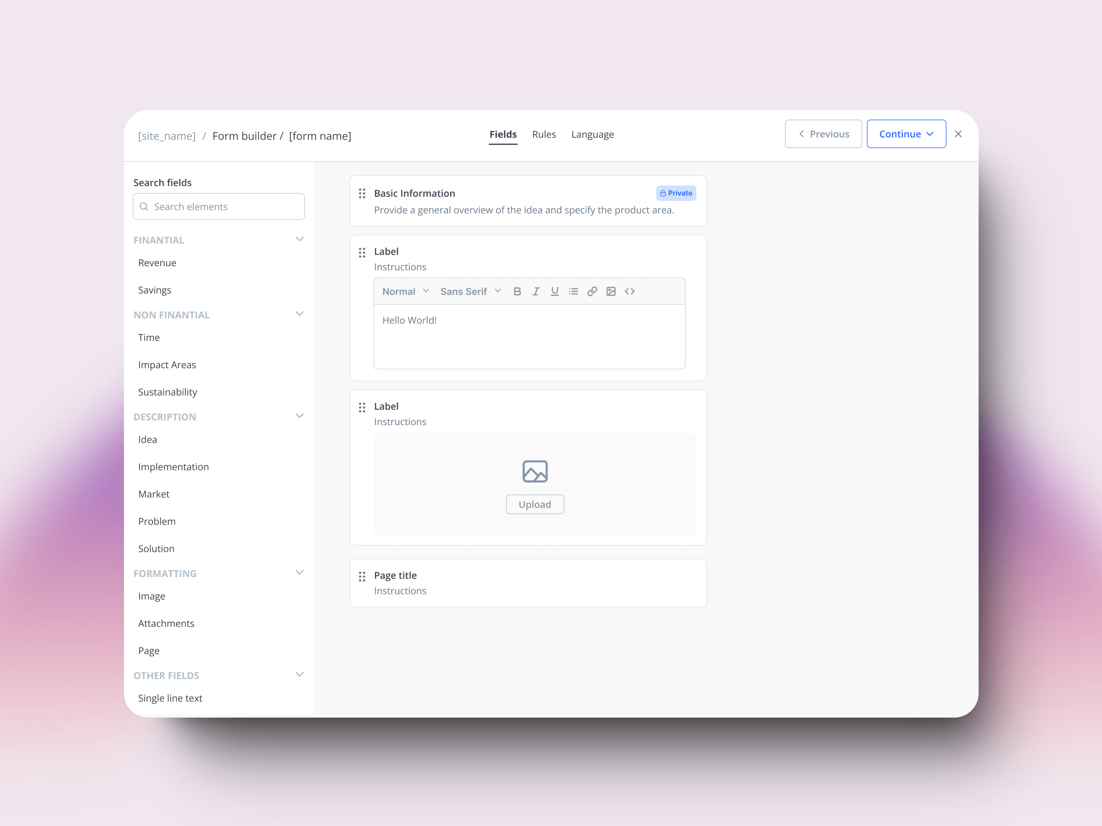
The form builder was the backbone of how 100+ enterprise innovation teams — Enel, NASA, AstraZeneca, Shell, Dow Chemical — collected ideas.
The redesign wasn't about adding features. This redesign was part of a platform-wide modernization bringing data intelligence capabilities to our B2B platform.
THE PROBLEM
Data, accessibility, scalability
The old builder gave customers everything: any field, any label, any configuration. In theory, flexibility. In practice, three problems compounding — and the third one would force us to rethink the other two.
Data. Every field was plain text. No way to aggregate, filter, or analyze across submissions.
Scalability. Every new requirement became a new toggle. The builder grew; the experience didn't. Customer success ended up configuring forms manually for customers who couldn't navigate them.
Accessibility. WCAG compliance was patched on top — audits after the fact, fixes layered over a builder never designed for it. But the WCAG work didn't just fix accessibility. It surfaced patterns we'd inherited without questioning, and forced us to rethink them across the system.
The company was rebuilding the platform on a new design system. The form builder was the right place to stop patching and rethink the model.
THE INVISIBLE WORK
Patterns we broke, patterns we built
The migration gave us a new component library. It didn't tell us when to use what — or which inherited conventions were worth keeping.
My colleague owned the token definition; I owned the bridge into engineering — keeping tokens consistent from Figma to code, components documented in Coda. Each call was small. Skipping any would have shown up later as a product that almost felt right.
DECISION 01
Combobox over checkboxes
Past 6 options, a combobox scans faster than a list of checkboxes. Below that, the checkboxes show all choices at once and win.
Status
DECISION 02
Active button, never disabled
Disabled states say nothing to screen readers and give sighted users no feedback. The button stays active and explains what's missing on click.
Fill required fields first
DECISION 03
Page numbering, not progress bars
"Page 2 of 5" tells you where you are and how far you have to go. A partially-filled bar tells screen readers nothing.
Old pattern
DECISION 04
Spinners interrupt everyone
And tell screen readers nothing useful. Optimistic updates commit the change immediately and revert on failure. The user keeps working; confirmation comes quietly.
Design tokens at scale
Miguel · 4 min read
Learnings
Accessibility isn't a checklist — it's a way of thinking. Designing accessible from the start doesn't just meet compliance, it improves the experience for everyone.
The deeper lesson came from the patterns themselves. WCAG started as a constraint and ended up doing something I didn't expect: it forced us to question conventions we'd inherited from every other B2B product. Disabled buttons, generic progress bars, fixed field widths — none of them were broken, but they weren't earning their keep either. Designing for users with disabilities turned out to be the fastest way to find the patterns worth keeping.